Category: EL Blogger

  • Create Slideshow HTML CSS Responsive Part 1

    www.laborblog.my.id - Learn how to create a responsive slideshow gallery with CSS and JavaScript. A slideshow is used to cycle through elements

    Example | Screenshot
    – Learn how to create a responsive slideshow gallery with CSS and JavaScript. A slideshow is used to cycle through elements:
    Step 1) Add HTML:

        
    <!-- Container for the image gallery -->
    <div class="container">
    
      <!-- Full-width images with number text -->
      <div class="mySlides">
        <div class="numbertext">1 / 6</div>
          <img src="img_woods_wide.jpg" style="width:100%">
      </div>
    
      <div class="mySlides">
        <div class="numbertext">2 / 6</div>
          <img src="img_5terre_wide.jpg" style="width:100%">
      </div>
    
      <div class="mySlides">
        <div class="numbertext">3 / 6</div>
          <img src="img_mountains_wide.jpg" style="width:100%">
      </div>
    
      <div class="mySlides">
        <div class="numbertext">4 / 6</div>
          <img src="img_lights_wide.jpg" style="width:100%">
      </div>
    
      <div class="mySlides">
        <div class="numbertext">5 / 6</div>
          <img src="img_nature_wide.jpg" style="width:100%">
      </div>
    
      <div class="mySlides">
        <div class="numbertext">6 / 6</div>
          <img src="img_snow_wide.jpg" style="width:100%">
      </div>
    
      <!-- Next and previous buttons -->
      <a class="prev" onclick="plusSlides(-1)">&#10094;</a>
      <a class="next" onclick="plusSlides(1)">&#10095;</a>
    
      <!-- Image text -->
      <div class="caption-container">
        <p id="caption"></p>
      </div>
    
      <!-- Thumbnail images -->
      <div class="row">
        <div class="column">
          <img class="demo cursor" src="img_woods.jpg" style="width:100%" onclick="currentSlide(1)" alt="The Woods">
        </div>
        <div class="column">
          <img class="demo cursor" src="img_5terre.jpg" style="width:100%" onclick="currentSlide(2)" alt="Cinque Terre">
        </div>
        <div class="column">
          <img class="demo cursor" src="img_mountains.jpg" style="width:100%" onclick="currentSlide(3)" alt="Mountains and fjords">
        </div>
        <div class="column">
          <img class="demo cursor" src="img_lights.jpg" style="width:100%" onclick="currentSlide(4)" alt="Northern Lights">
        </div>
        <div class="column">
          <img class="demo cursor" src="img_nature.jpg" style="width:100%" onclick="currentSlide(5)" alt="Nature and sunrise">
        </div>
        <div class="column">
          <img class="demo cursor" src="img_snow.jpg" style="width:100%" onclick="currentSlide(6)" alt="Snowy Mountains">
        </div>
      </div>
    </div>
     
    
    Step 2) Add CSS:
    Style the image gallery, next and previous buttons, the caption text and the dots:

        
        * {
      box-sizing: border-box;
    }
    /* Position the image container (needed to position the left and right arrows) */
    .container {
      position: relative;
    }
    /* Hide the images by default */
    .mySlides {
      display: none;
    }
    /* Add a pointer when hovering over the thumbnail images */
    .cursor {
      cursor: pointer;
    }
    /* Next & previous buttons */
    .prev,
    .next {
      cursor: pointer;
      position: absolute;
      top: 40%;
      width: auto;
      padding: 16px;
      margin-top: -50px;
      color: white;
      font-weight: bold;
      font-size: 20px;
      border-radius: 0 3px 3px 0;
      user-select: none;
      -webkit-user-select: none;
    }
    /* Position the "next button" to the right */
    .next {
      right: 0;
      border-radius: 3px 0 0 3px;
    }
    /* On hover, add a black background color with a little bit see-through */
    .prev:hover,
    .next:hover {
      background-color: rgba(0, 0, 0, 0.8);
    }
    /* Number text (1/3 etc) */
    .numbertext {
      color: #f2f2f2;
      font-size: 12px;
      padding: 8px 12px;
      position: absolute;
      top: 0;
    }
    /* Container for image text */
    .caption-container {
      text-align: center;
      background-color: #222;
      padding: 2px 16px;
      color: white;
    }
    .row:after {
      content: "";
      display: table;
      clear: both;
    }
    /* Six columns side by side */
    .column {
      float: left;
      width: 16.66%;
    }
    /* Add a transparency effect for thumnbail images */
    .demo {
      opacity: 0.6;
    }
    .active,
    .demo:hover {
      opacity: 1;
    }
     
    
    Step 3) Add JavaScript:

        
        var slideIndex = 1;
    showSlides(slideIndex);
    
    // Next/previous controls
    function plusSlides(n) {
      showSlides(slideIndex += n);
    }
    
    // Thumbnail image controls
    function currentSlide(n) {
      showSlides(slideIndex = n);
    }
    
    function showSlides(n) {
      var i;
      var slides = document.getElementsByClassName("mySlides");
      var dots = document.getElementsByClassName("demo");
      var captionText = document.getElementById("caption");
      if (n > slides.length) {slideIndex = 1}
      if (n < 1) {slideIndex = slides.length}
      for (i = 0; i < slides.length; i++) {
        slides[i].style.display = "none";
      }
      for (i = 0; i < dots.length; i++) {
        dots[i].className = dots[i].className.replace(" active", "");
      }
      slides[slideIndex-1].style.display = "block";
      dots[slideIndex-1].className += " active";
      captionText.innerHTML = dots[slideIndex-1].alt;
    }
     
    
    Source: w3schools

  • How to Copy Text to Clipboard

    www.laborblog.my.id - "Copy to Clipboard" is useful animation for every website related to coding. We think every developer needs to know how it works.

    Screenshot
    – “Copy to Clipboard” is useful animation for every website related to coding. We think every developer needs to know how it works. Because the developer needs to implement this kind of functionality in the website.
    We found many articles which provide solution to copy to clip board, but we were not satisfied with them as the codes were lengthy and wrote useless JavaScript. But in the end we have created a “copy to clipboard” animation using just five lines of JavaScript code. Here the overall code is long due to css otherwise the javascript code is very short.
    So let’s know about this animation how it will work. First you’ll find a textarea, it will also have a copy button. As soon as you click the button, the textarea content will be copied and the button’s “copied” will be written for 3 seconds.
    If you want to learn animation using javascript and js plugins, We have already created a lot of animation using various plugins of javascript, check out the playlist. We hope you like it.
    1. HTML Struktur

        
    <!DOCTYPE html>
    <html>
    <head>
      <title>Copy To Clipboard JavaScript | laborblog.my.id</title>
    <link rel="stylesheet" href="style.css">
    </head>
    <body>
    main content...
    </body>
    </html>


    2. HTML

        
    <!DOCTYPE html>
    <html>
      <head>
        <title>Copy To Clipboard JavaScript | laborblog.my.id</title>
        <link rel="stylesheet" type="text/css" href="style.css">
      </head>
      <body>
        <div class="container">
          <textarea placeholder="Message" cols="30" rows="10" class="copy-text"></textarea>
          <button class="copy-btn">Copy</button>
        </div>
        <script src="script.js"></script>
      </body>
    </html>


    3. CSS

        
        {
      margin: 0px;
      padding: 0px;
      font-family: "Poppins", sans-serif;
      background: #F7EDE2;
      display: flex;
      height: 100vh;
      justify-content: center;
      align-items: center;
    }
    
    .container{
      background: white;
      padding: 40px;
      display: flex;
      flex-direction: column;
      justify-content: center;
      border-radius: 6px;
    }
    
    .copy-text{
      border: 2px solid #111;
      padding: 16px 20px;
      font-size: 16px;
      font-weight: 600;
      height: 350px;
      width: 800px;
      margin-bottom: 20px;
      font-family: inherit;
      border-radius: 2px;
    }
    
    .copy-btn{
      padding: 12px 32px;
      border: 0px;
      background: #3F88C5;
      color: white;
      width: 120px;
      font-size: 16px;
      font-family: inherit;
      cursor: pointer;
      font-weight: 600;
    }
    
    .copied{
      background: #04AA6D;
      transition: 0.5s;
    }


    4. Javascript

        
        const btn = document.querySelector(".copy-btn");
    const text = document.querySelector(".copy-text");
    
    btn.addEventListener("click", () =>{
      text.select();
      text.setSelectionRange(0, 10000);
      document.execCommand("copy");
      btn.classList.toggle("copied");
      btn.innerHTML = "Copied!";
    
      setTimeout(function(){
        btn.classList.toggle("copied");
        btn.innerHTML = "Copy";
      }, 3000);
    });


  • How to Refresh Ad Slots Automatically?

    www.laborblog.my.id - There are multiple ways to refresh ad slots using GPT library function. But none of the documents or examples provided for auto refreshing ad slots based on Time event.

    illustration | pragmaticwebmedia.com
    – There are multiple ways to refresh ad slots using GPT library function. But none of the documents or examples provided for auto refreshing ad slots based on Time event.


    How to do?
    Declare variable name globally before ‘cmd.push’ function and assign to the ad slot declaration. Example see below
    var slot1;
    Assign variable to the ad slot.
    Add that variable before the ad slot in the header tag.
    slot1 = googletag.defineSlot(‘/200894144/Responsive’, [[300, 250], [300, 600]], ‘div-gpt-ad-1620832289302-0’).addService(googletag.pubads());
    Auto Refresh Trigger
    The final step is to trigger auto refresh using ‘SetInterval’ function on the Body code. This will trigger the refresh code on specified interval.
    setInterval(function(){googletag.pubads().refresh([slot1]);}, 3000);
    The variable which declared on the first step to be added within the refresh function on the above code. “3000” represent three second time interval . Time cab be adjusted based on your requirement. Best practices is minimum 30 seconds.
    Complete Code Configuration
    Here is the full code representation for the above discussions. Added key values for the test purposed. Ignore that in your code and replace as per your requirements.

    <script async src=”https://securepubads.g.doubleclick.net/tag/js/gpt.js”></script>
    <script>
    window.googletag = window.googletag || {cmd: []};
    var slot1;
    googletag.cmd.push(function() {
    slot1 = googletag.defineSlot(‘/200894144/Responsive’, [[300, 250], [300, 600]], ‘div-gpt-ad-1620832289302-0’).setTargeting(“Test_Mode”, “ON”).addService(googletag.pubads());
    googletag.enableServices();
    });
    </script>
    <div id=’div-gpt-ad-1620832289302-0′>
    <script>
    googletag.cmd.push(function() { googletag.display(‘div-gpt-ad-1620832289302-0’);
    setInterval(function(){googletag.pubads().refresh([slot1]);}, 3000);
    });
    </script>
    </div>


    Hope this article helps!!!. Please share your comments. Thank You!!!![source]
    *The information contained in this post is for general information purposes only. The information is provided by How to auto refresh ad slots? and while we endeavor to keep the information up to date and correct, we make no representations or warranties of any kind, express or implied, about the completeness, accuracy, reliability, suitability or availability with respect to the website or the information, products, services, or related graphics contained on the post for any purpose.
  • Splitting a Long Blog Post in Blogger Into Multiple Pages

    www.laborblog.my.id - Splitting posts in wordpress is very simple and there are many plugins to achieve this, but how it’s done in Blogger.
    illustration
    – Splitting posts in wordpress is very simple and there are many plugins to achieve this, but how it’s done in Blogger. In Blogger there is no build in feature to split posts or pages and there are no widgets to paginate, but by using a simple jQuery function you can paginate your blog posts.
    So why to split a blog post? We have already discussed all the benefits of adding pagination to blog posts in this article. Here we will show you how to split long blog post in Blogger into multiple pages.
    Don’t panic, the code below is simple and easy to understand. Assume that you are about to publish a long blog post and would like to split that into 4 pages. Here is how you do that in just 3 simple steps.
    How to split long blog post in Blogger into multiple pages
    Step 1: Usually you will edit your post in compose mode, but this time you are going to do this in HTML mode. Switch to HTML editor, add the span element that you see below and add your blog content in each element respectively.
    From the below lines you can see that only 1st page content is visible and the remaining 2nd, 3rd and 4th pages are hidden. So the remaining pages will be visible only if the visitor navigates.

    <span class=”content1″>
    Add your first page content here
    </span>
    <span class=”content2″ style=”display:none”>
    Add your second page content here
    </span>
    <span class=”content3″ style=”display:none”>
    Add your third page content here
    </span>
    <span class=”content4″ style=”display:none”>
    Add your final page content here
    </span>

    Step 2: Hope you have added your content. Now you have to create page links so when a user clicks on that page he or she should get that particular content. Just below to the above code add this one which adds Pages: 1 2 3 4 links below your post content.

    <p><b>Pages: <span style=”color: #3d85c6;”>
    <a href=”#” class=”page1″>1</a>
    <a href=”#” class=”page2″>2</a>
    <a href=”#” class=”page3″>3</a>
    <a href=”#” class=”page4″>4</a></span></b></p>

    Step 3: Next to make this links to work add the following script just below the pagination links.

    <script src=”//ajax.googleapis.com/ajax/libs/jquery/1.11.1/jquery.min.js”></script>
    <script style=”text/javascript”>
    jQuery(document).ready(function(){
    jQuery(‘.page1’).click(function(){
    jQuery(‘.content1’).show();
    jQuery(‘.content2’).hide();
    jQuery(‘.content3’).hide();
    jQuery(‘.content4’).hide();
    return false;
    });
    jQuery(‘.page2’).click(function(){
    jQuery(‘.content1’).hide();
    jQuery(‘.content2’).show();
    jQuery(‘.content3’).hide();
    jQuery(‘.content4’).hide();
    return false;
    });
    jQuery(‘.page3’).click(function(){
    jQuery(‘.content1’).hide();
    jQuery(‘.content2’).hide();
    jQuery(‘.content3’).show();
    jQuery(‘.content4’).hide();
    return false;
    });
    jQuery(‘.page4’).click(function(){
    jQuery(‘.content1’).hide();
    jQuery(‘.content2’).hide();
    jQuery(‘.content3’).hide();
    jQuery(‘.content4’).show();
    return false;
    });
    });
    </script>


    That’s it! When everything is done publish your article and view it where you will see page links below the content. Just click on the links to see how it works. Hope that helped you to split long blog posts in Blogger into multiple pages. Got any questions? Feel free to ask below in comments section.[source]
  • CSS Button HTML

    www.laborblog.my.id - Button is one of the HTML elements that are often found on a website, this element is usually used to submit forms or it could be for other things.

    CSS Button HTML
    Button is one of the html elements that are often found on a website, this element is usually used to submit forms or it could be for other things. Here are some interesting button options:


    <!– HTML !–>
    <button class=”button-1″ role=”button”>Button 1</button>
    <!– CSS !–>
    <style>
    .button-1 {
    background-color: #EA4C89;
    border-radius: 8px;
    border-style: none;
    box-sizing: border-box;
    color: #FFFFFF;
    cursor: pointer;
    display: inline-block;
    font-family: “Haas Grot Text R Web”, “Helvetica Neue”, Helvetica, Arial, sans-serif;
    font-size: 14px;
    font-weight: 500;
    height: 40px;
    line-height: 20px;
    list-style: none;
    margin: 0;
    outline: none;
    padding: 10px 16px;
    position: relative;
    text-align: center;
    text-decoration: none;
    transition: color 100ms;
    vertical-align: baseline;
    user-select: none;
    -webkit-user-select: none;
    touch-action: manipulation;
    }

    .button-1:hover,
    .button-1:focus {
    background-color: #F082AC;
    }
    </style>

    <!– HTML !–>
    <button class=”button-2″ role=”button”>Button 2</button>
    <!– CSS !–>
    <style>
    .button-2 {
    background-color: rgba(51, 51, 51, 0.05);
    border-radius: 8px;
    border-width: 0;
    color: #333333;
    cursor: pointer;
    display: inline-block;
    font-family: “Haas Grot Text R Web”, “Helvetica Neue”, Helvetica, Arial, sans-serif;
    font-size: 14px;
    font-weight: 500;
    line-height: 20px;
    list-style: none;
    margin: 0;
    padding: 10px 12px;
    text-align: center;
    transition: all 200ms;
    vertical-align: baseline;
    white-space: nowrap;
    user-select: none;
    -webkit-user-select: none;
    touch-action: manipulation;
    }
    </style>

    <!– HTML !–>
    <button class=”button-3″ role=”button”>Button 3</button>
    <!– CSS !–>
    <style>
    .button-3 {
    appearance: none;
    background-color: #2ea44f;
    border: 1px solid rgba(27, 31, 35, .15);
    border-radius: 6px;
    box-shadow: rgba(27, 31, 35, .1) 0 1px 0;
    box-sizing: border-box;
    color: #fff;
    cursor: pointer;
    display: inline-block;
    font-family: -apple-system,system-ui,”Segoe UI”,Helvetica,Arial,sans-serif,”Apple Color Emoji”,”Segoe UI Emoji”;
    font-size: 14px;
    font-weight: 600;
    line-height: 20px;
    padding: 6px 16px;
    position: relative;
    text-align: center;
    text-decoration: none;
    user-select: none;
    -webkit-user-select: none;
    touch-action: manipulation;
    vertical-align: middle;
    white-space: nowrap;
    }

    .button-3:focus:not(:focus-visible):not(.focus-visible) {
    box-shadow: none;
    outline: none;
    }

    .button-3:hover {
    background-color: #2c974b;
    }

    .button-3:focus {
    box-shadow: rgba(46, 164, 79, .4) 0 0 0 3px;
    outline: none;
    }

    .button-3:disabled {
    background-color: #94d3a2;
    border-color: rgba(27, 31, 35, .1);
    color: rgba(255, 255, 255, .8);
    cursor: default;
    }

    .button-3:active {
    background-color: #298e46;
    box-shadow: rgba(20, 70, 32, .2) 0 1px 0 inset;
    }
    </style>

    <!– HTML !–>
    <button class=”button-4″ role=”button”>Button 4</button>
    <!– CSS !–>
    <style>
    .button-4 {
    appearance: none;
    background-color: #FAFBFC;
    border: 1px solid rgba(27, 31, 35, 0.15);
    border-radius: 6px;
    box-shadow: rgba(27, 31, 35, 0.04) 0 1px 0, rgba(255, 255, 255, 0.25) 0 1px 0 inset;
    box-sizing: border-box;
    color: #24292E;
    cursor: pointer;
    display: inline-block;
    font-family: -apple-system, system-ui, “Segoe UI”, Helvetica, Arial, sans-serif, “Apple Color Emoji”, “Segoe UI Emoji”;
    font-size: 14px;
    font-weight: 500;
    line-height: 20px;
    list-style: none;
    padding: 6px 16px;
    position: relative;
    transition: background-color 0.2s cubic-bezier(0.3, 0, 0.5, 1);
    user-select: none;
    -webkit-user-select: none;
    touch-action: manipulation;
    vertical-align: middle;
    white-space: nowrap;
    word-wrap: break-word;
    }

    .button-4:hover {
    background-color: #F3F4F6;
    text-decoration: none;
    transition-duration: 0.1s;
    }

    .button-4:disabled {
    background-color: #FAFBFC;
    border-color: rgba(27, 31, 35, 0.15);
    color: #959DA5;
    cursor: default;
    }

    .button-4:active {
    background-color: #EDEFF2;
    box-shadow: rgba(225, 228, 232, 0.2) 0 1px 0 inset;
    transition: none 0s;
    }

    .button-4:focus {
    outline: 1px transparent;
    }

    .button-4:before {
    display: none;
    }

    .button-4:-webkit-details-marker {
    display: none;
    }
    </style>

    <!– HTML !–>
    <button class=”button-5″ role=”button”>Button 5</button>
    <style>
    /* CSS */
    .button-5 {
    align-items: center;
    background-clip: padding-box;
    background-color: #fa6400;
    border: 1px solid transparent;
    border-radius: .25rem;
    box-shadow: rgba(0, 0, 0, 0.02) 0 1px 3px 0;
    box-sizing: border-box;
    color: #fff;
    cursor: pointer;
    display: inline-flex;
    font-family: system-ui,-apple-system,system-ui,”Helvetica Neue”,Helvetica,Arial,sans-serif;
    font-size: 16px;
    font-weight: 600;
    justify-content: center;
    line-height: 1.25;
    margin: 0;
    min-height: 3rem;
    padding: calc(.875rem – 1px) calc(1.5rem – 1px);
    position: relative;
    text-decoration: none;
    transition: all 250ms;
    user-select: none;
    -webkit-user-select: none;
    touch-action: manipulation;
    vertical-align: baseline;
    width: auto;
    }

    .button-5:hover,
    .button-5:focus {
    background-color: #fb8332;
    box-shadow: rgba(0, 0, 0, 0.1) 0 4px 12px;
    }

    .button-5:hover {
    transform: translateY(-1px);
    }

    .button-5:active {
    background-color: #c85000;
    box-shadow: rgba(0, 0, 0, .06) 0 2px 4px;
    transform: translateY(0);
    }
    </style>

    <!– HTML !–>
    <button class=”button-6″ role=”button”>Button 6</button>
    <style>
    .button-6 {
    align-items: center;
    background-color: #FFFFFF;
    border: 1px solid rgba(0, 0, 0, 0.1);
    border-radius: .25rem;
    box-shadow: rgba(0, 0, 0, 0.02) 0 1px 3px 0;
    box-sizing: border-box;
    color: rgba(0, 0, 0, 0.85);
    cursor: pointer;
    display: inline-flex;
    font-family: system-ui,-apple-system,system-ui,”Helvetica Neue”,Helvetica,Arial,sans-serif;
    font-size: 16px;
    font-weight: 600;
    justify-content: center;
    line-height: 1.25;
    margin: 0;
    min-height: 3rem;
    padding: calc(.875rem – 1px) calc(1.5rem – 1px);
    position: relative;
    text-decoration: none;
    transition: all 250ms;
    user-select: none;
    -webkit-user-select: none;
    touch-action: manipulation;
    vertical-align: baseline;
    width: auto;
    }

    .button-6:hover,
    .button-6:focus {
    border-color: rgba(0, 0, 0, 0.15);
    box-shadow: rgba(0, 0, 0, 0.1) 0 4px 12px;
    color: rgba(0, 0, 0, 0.65);
    }

    .button-6:hover {
    transform: translateY(-1px);
    }

    .button-6:active {
    background-color: #F0F0F1;
    border-color: rgba(0, 0, 0, 0.15);
    box-shadow: rgba(0, 0, 0, 0.06) 0 2px 4px;
    color: rgba(0, 0, 0, 0.65);
    transform: translateY(0);
    }
    </style>

    <!– HTML !–>
    <button class=”button-7″ role=”button”>Button 7</button>
    <style>
    .button-7 {
    background-color: #0095ff;
    border: 1px solid transparent;
    border-radius: 3px;
    box-shadow: rgba(255, 255, 255, .4) 0 1px 0 0 inset;
    box-sizing: border-box;
    color: #fff;
    cursor: pointer;
    display: inline-block;
    font-family: -apple-system,system-ui,”Segoe UI”,”Liberation Sans”,sans-serif;
    font-size: 13px;
    font-weight: 400;
    line-height: 1.15385;
    margin: 0;
    outline: none;
    padding: 8px .8em;
    position: relative;
    text-align: center;
    text-decoration: none;
    user-select: none;
    -webkit-user-select: none;
    touch-action: manipulation;
    vertical-align: baseline;
    white-space: nowrap;
    }

    .button-7:hover,
    .button-7:focus {
    background-color: #07c;
    }

    .button-7:focus {
    box-shadow: 0 0 0 4px rgba(0, 149, 255, .15);
    }

    .button-7:active {
    background-color: #0064bd;
    box-shadow: none;
    }
    </style>

    <!– HTML !–>
    <button class=”button-8″ role=”button”>Button 8</button>
    <!– CSS!–>
    <style>
    .button-8 {
    background-color: #e1ecf4;
    border-radius: 3px;
    border: 1px solid #7aa7c7;
    box-shadow: rgba(255, 255, 255, .7) 0 1px 0 0 inset;
    box-sizing: border-box;
    color: #39739d;
    cursor: pointer;
    display: inline-block;
    font-family: -apple-system,system-ui,”Segoe UI”,”Liberation Sans”,sans-serif;
    font-size: 13px;
    font-weight: 400;
    line-height: 1.15385;
    margin: 0;
    outline: none;
    padding: 8px .8em;
    position: relative;
    text-align: center;
    text-decoration: none;
    user-select: none;
    -webkit-user-select: none;
    touch-action: manipulation;
    vertical-align: baseline;
    white-space: nowrap;
    }

    .button-8:hover,
    .button-8:focus {
    background-color: #b3d3ea;
    color: #2c5777;
    }

    .button-8:focus {
    box-shadow: 0 0 0 4px rgba(0, 149, 255, .15);
    }

    .button-8:active {
    background-color: #a0c7e4;
    box-shadow: none;
    color: #2c5777;
    }
    </style>

    <!– HTML !–>
    <button class=”button-9″ role=”button”>Button 9</button>
    <!– CSS!–>
    <style>
    .button-9 {
    align-items: center;
    appearance: none;
    background-color: #fff;
    border-radius: 24px;
    border-style: none;
    box-shadow: rgba(0, 0, 0, .2) 0 3px 5px -1px,rgba(0, 0, 0, .14) 0 6px 10px 0,rgba(0, 0, 0, .12) 0 1px 18px 0;
    box-sizing: border-box;
    color: #3c4043;
    cursor: pointer;
    display: inline-flex;
    fill: currentcolor;
    font-family: “Google Sans”,Roboto,Arial,sans-serif;
    font-size: 14px;
    font-weight: 500;
    height: 48px;
    justify-content: center;
    letter-spacing: .25px;
    line-height: normal;
    max-width: 100%;
    overflow: visible;
    padding: 2px 24px;
    position: relative;
    text-align: center;
    text-transform: none;
    transition: box-shadow 280ms cubic-bezier(.4, 0, .2, 1),opacity 15ms linear 30ms,transform 270ms cubic-bezier(0, 0, .2, 1) 0ms;
    user-select: none;
    -webkit-user-select: none;
    touch-action: manipulation;
    width: auto;
    will-change: transform,opacity;
    z-index: 0;
    }

    .button-9:hover {
    background: #F6F9FE;
    color: #174ea6;
    }

    .button-9:active {
    box-shadow: 0 4px 4px 0 rgb(60 64 67 / 30%), 0 8px 12px 6px rgb(60 64 67 / 15%);
    outline: none;
    }

    .button-9:focus {
    outline: none;
    border: 2px solid #4285f4;
    }

    .button-9:not(:disabled) {
    box-shadow: rgba(60, 64, 67, .3) 0 1px 3px 0, rgba(60, 64, 67, .15) 0 4px 8px 3px;
    }

    .button-9:not(:disabled):hover {
    box-shadow: rgba(60, 64, 67, .3) 0 2px 3px 0, rgba(60, 64, 67, .15) 0 6px 10px 4px;
    }

    .button-9:not(:disabled):focus {
    box-shadow: rgba(60, 64, 67, .3) 0 1px 3px 0, rgba(60, 64, 67, .15) 0 4px 8px 3px;
    }

    .button-9:not(:disabled):active {
    box-shadow: rgba(60, 64, 67, .3) 0 4px 4px 0, rgba(60, 64, 67, .15) 0 8px 12px 6px;
    }

    .button-9:disabled {
    box-shadow: rgba(60, 64, 67, .3) 0 1px 3px 0, rgba(60, 64, 67, .15) 0 4px 8px 3px;
    }
    </style>

    <!– HTML !–>
    <button class=”button-10″ role=”button”>Button 10</button>
    <!– CSS!–>
    <style>
    .button-10 {
    appearance: button;
    background-color: #1899D6;
    border: solid transparent;
    border-radius: 16px;
    border-width: 0 0 4px;
    box-sizing: border-box;
    color: #FFFFFF;
    cursor: pointer;
    display: inline-block;
    font-family: din-round,sans-serif;
    font-size: 15px;
    font-weight: 700;
    letter-spacing: .8px;
    line-height: 20px;
    margin: 0;
    outline: none;
    overflow: visible;
    padding: 13px 16px;
    text-align: center;
    text-transform: uppercase;
    touch-action: manipulation;
    transform: translateZ(0);
    transition: filter .2s;
    user-select: none;
    -webkit-user-select: none;
    vertical-align: middle;
    white-space: nowrap;
    width: 18%;
    }

    .button-10:after {
    background-clip: padding-box;
    background-color: #1CB0F6;
    border: solid transparent;
    border-radius: 16px;
    border-width: 0 0 4px;
    bottom: -4px;
    content: “”;
    left: 0;
    position: absolute;
    right: 0;
    top: 0;
    z-index: -1;
    }

    .button-10:main,
    .button-10:focus {
    user-select: auto;
    }

    .button-10:hover:not(:disabled) {
    filter: brightness(1.1);
    }

    .button-10:disabled {
    cursor: auto;
    }
    </style>

    <!– HTML !–>
    <button class=”button-11″ role=”button”>Button 11</button>
    <!– CSS!–>
    <style>
    .button-11 {
    background: #FF4742;
    border: 1px solid #FF4742;
    border-radius: 6px;
    box-shadow: rgba(0, 0, 0, 0.1) 1px 2px 4px;
    box-sizing: border-box;
    color: #FFFFFF;
    cursor: pointer;
    display: inline-block;
    font-family: nunito,roboto,proxima-nova,”proxima nova”,sans-serif;
    font-size: 16px;
    font-weight: 800;
    line-height: 16px;
    min-height: 40px;
    outline: 0;
    padding: 12px 14px;
    text-align: center;
    text-rendering: geometricprecision;
    text-transform: none;
    user-select: none;
    -webkit-user-select: none;
    touch-action: manipulation;
    vertical-align: middle;
    }

    .button-11:hover,
    .button-11:active {
    background-color: initial;
    background-position: 0 0;
    color: #FF4742;
    }

    .button-11:active {
    opacity: .5;
    }
    </style>

    <!– HTML !–>
    <button class=”button-12″ role=”button”>Button 12</button>
    <!– CSS!–>
    <style>
    .button-12 {
    appearance: none;
    background-color: #000000;
    border: 2px solid #1A1A1A;
    border-radius: 15px;
    box-sizing: border-box;
    color: #FFFFFF;
    cursor: pointer;
    display: inline-block;
    font-family: Roobert,-apple-system,BlinkMacSystemFont,”Segoe UI”,Helvetica,Arial,sans-serif,”Apple Color Emoji”,”Segoe UI Emoji”,”Segoe UI Symbol”;
    font-size: 16px;
    font-weight: 600;
    line-height: normal;
    margin: 0;
    min-height: 60px;
    min-width: 0;
    outline: none;
    padding: 16px 24px;
    text-align: center;
    text-decoration: none;
    transition: all 300ms cubic-bezier(.23, 1, 0.32, 1);
    user-select: none;
    -webkit-user-select: none;
    touch-action: manipulation;
    width: 19%;
    will-change: transform;
    }

    .button-12:disabled {
    pointer-events: none;
    }

    .button-12:hover {
    box-shadow: rgba(0, 0, 0, 0.25) 0 8px 15px;
    transform: translateY(-2px);
    }

    .button-12:active {
    box-shadow: none;
    transform: translateY(0);
    }
    </style>

    <!– HTML !–>
    <button class=”button-13″ role=”button”>Button 13</button>
    <!– CSS!–>
    <style>
    .button-13 {
    appearance: none;
    background-color: transparent;
    border: 2px solid #1A1A1A;
    border-radius: 15px;
    box-sizing: border-box;
    color: #3B3B3B;
    cursor: pointer;
    display: inline-block;
    font-family: Roobert,-apple-system,BlinkMacSystemFont,”Segoe UI”,Helvetica,Arial,sans-serif,”Apple Color Emoji”,”Segoe UI Emoji”,”Segoe UI Symbol”;
    font-size: 16px;
    font-weight: 600;
    line-height: normal;
    margin: 0;
    min-height: 60px;
    min-width: 0;
    outline: none;
    padding: 16px 24px;
    text-align: center;
    text-decoration: none;
    transition: all 300ms cubic-bezier(.23, 1, 0.32, 1);
    user-select: none;
    -webkit-user-select: none;
    touch-action: manipulation;
    width: 19%;
    will-change: transform;
    }

    .button-13:disabled {
    pointer-events: none;
    }

    .button-13:hover {
    color: #fff;
    background-color: #1A1A1A;
    box-shadow: rgba(0, 0, 0, 0.25) 0 8px 15px;
    transform: translateY(-2px);
    }

    .button-13:active {
    box-shadow: none;
    transform: translateY(0);
    }
    </style>

    <!– HTML !–>
    <button class=”button-14″ role=”button”>Button 14</button>
    <!– CSS!–>
    <style>
    .button-14 {
    align-items: center;
    appearance: none;
    background-image: radial-gradient(100% 100% at 100% 0, #5adaff 0, #5468ff 100%);
    border: 0;
    border-radius: 6px;
    box-shadow: rgba(45, 35, 66, .4) 0 2px 4px,rgba(45, 35, 66, .3) 0 7px 13px -3px,rgba(58, 65, 111, .5) 0 -3px 0 inset;
    box-sizing: border-box;
    color: #fff;
    cursor: pointer;
    display: inline-flex;
    font-family: “JetBrains Mono”,monospace;
    height: 48px;
    justify-content: center;
    line-height: 1;
    list-style: none;
    overflow: hidden;
    padding-left: 16px;
    padding-right: 16px;
    position: relative;
    text-align: left;
    text-decoration: none;
    transition: box-shadow .15s,transform .15s;
    user-select: none;
    -webkit-user-select: none;
    touch-action: manipulation;
    white-space: nowrap;
    will-change: box-shadow,transform;
    font-size: 18px;
    }

    .button-14:focus {
    box-shadow: #3c4fe0 0 0 0 1.5px inset, rgba(45, 35, 66, .4) 0 2px 4px, rgba(45, 35, 66, .3) 0 7px 13px -3px, #3c4fe0 0 -3px 0 inset;
    }

    .button-14:hover {
    box-shadow: rgba(45, 35, 66, .4) 0 4px 8px, rgba(45, 35, 66, .3) 0 7px 13px -3px, #3c4fe0 0 -3px 0 inset;
    transform: translateY(-2px);
    }

    .button-14:active {
    box-shadow: #3c4fe0 0 3px 7px inset;
    transform: translateY(2px);
    }
    </style>

    <!– HTML !–>
    <button class=”button-15″ role=”button”>Button 15</button>
    <!– CSS!–>
    <style>
    .button-15 {
    align-items: center;
    appearance: none;
    background-color: #FCFCFD;
    border-radius: 4px;
    border-width: 0;
    box-shadow: rgba(45, 35, 66, 0.4) 0 2px 4px,rgba(45, 35, 66, 0.3) 0 7px 13px -3px,#D6D6E7 0 -3px 0 inset;
    box-sizing: border-box;
    color: #36395A;
    cursor: pointer;
    display: inline-flex;
    font-family: “JetBrains Mono”,monospace;
    height: 48px;
    justify-content: center;
    line-height: 1;
    list-style: none;
    overflow: hidden;
    padding-left: 16px;
    padding-right: 16px;
    position: relative;
    text-align: left;
    text-decoration: none;
    transition: box-shadow .15s,transform .15s;
    user-select: none;
    -webkit-user-select: none;
    touch-action: manipulation;
    white-space: nowrap;
    will-change: box-shadow,transform;
    font-size: 18px;
    }

    .button-15:focus {
    box-shadow: #D6D6E7 0 0 0 1.5px inset, rgba(45, 35, 66, 0.4) 0 2px 4px, rgba(45, 35, 66, 0.3) 0 7px 13px -3px, #D6D6E7 0 -3px 0 inset;
    }

    .button-15:hover {
    box-shadow: rgba(45, 35, 66, 0.4) 0 4px 8px, rgba(45, 35, 66, 0.3) 0 7px 13px -3px, #D6D6E7 0 -3px 0 inset;
    transform: translateY(-2px);
    }

    .button-15:active {
    box-shadow: #D6D6E7 0 3px 7px inset;
    transform: translateY(2px);
    }
    </style>

    <!– HTML !–>
    <button class=”button-16″ role=”button”>Button 16</button>
    <!– CSS!–>
    <style>
    .button-16 {
    background-color: #222;
    border-radius: 4px;
    border-style: none;
    box-sizing: border-box;
    color: #fff;
    cursor: pointer;
    display: inline-block;
    font-family: “Farfetch Basis”,”Helvetica Neue”,Arial,sans-serif;
    font-size: 16px;
    font-weight: 700;
    line-height: 1.5;
    margin: 0;
    max-width: none;
    min-height: 44px;
    min-width: 10px;
    outline: none;
    overflow: hidden;
    padding: 9px 20px 8px;
    position: relative;
    text-align: center;
    text-transform: none;
    user-select: none;
    -webkit-user-select: none;
    touch-action: manipulation;
    width: 19%;
    }

    .button-16:hover,
    .button-16:focus {
    opacity: .75;
    }
    </style>

    <!– HTML !–>
    <button class=”button-17″ role=”button”>Button 17</button>
    <!– CSS!–>
    <style>
    .button-17 {
    background-color: #fff000;
    border-radius: 12px;
    color: #000;
    cursor: pointer;
    font-weight: bold;
    padding: 10px 15px;
    text-align: center;
    transition: 200ms;
    width: 16%;
    box-sizing: border-box;
    border: 0;
    font-size: 16px;
    user-select: none;
    -webkit-user-select: none;
    touch-action: manipulation;
    }

    .button-17:not(:disabled):hover,
    .button-17:not(:disabled):focus {
    outline: 0;
    background: #f4e603;
    box-shadow: 0 0 0 2px rgba(0,0,0,.2), 0 3px 8px 0 rgba(0,0,0,.15);
    }

    .button-17:disabled {
    filter: saturate(0.2) opacity(0.5);
    cursor: not-allowed;
    }
    </style>

    <!– HTML !–>
    <button class=”button-18″ role=”button”>Button 18</button>
    <!– CSS!–>
    <style>
    .button-18 {
    background-color: #c2fbd7;
    border-radius: 100px;
    box-shadow: rgba(44, 187, 99, .2) 0 -25px 18px -14px inset,rgba(44, 187, 99, .15) 0 1px 2px,rgba(44, 187, 99, .15) 0 2px 4px,rgba(44, 187, 99, .15) 0 4px 8px,rgba(44, 187, 99, .15) 0 8px 16px,rgba(44, 187, 99, .15) 0 16px 32px;
    color: green;
    cursor: pointer;
    display: inline-block;
    font-family: CerebriSans-Regular,-apple-system,system-ui,Roboto,sans-serif;
    padding: 7px 20px;
    text-align: center;
    text-decoration: none;
    transition: all 250ms;
    border: 0;
    font-size: 16px;
    user-select: none;
    -webkit-user-select: none;
    touch-action: manipulation;
    }

    .button-18:hover {
    box-shadow: rgba(44,187,99,.35) 0 -25px 18px -14px inset,rgba(44,187,99,.25) 0 1px 2px,rgba(44,187,99,.25) 0 2px 4px,rgba(44,187,99,.25) 0 4px 8px,rgba(44,187,99,.25) 0 8px 16px,rgba(44,187,99,.25) 0 16px 32px;
    transform: scale(1.05) rotate(-1deg);
    }
    </style>

    <!– HTML !–>
    <button class=”button-19″ role=”button”>Button 19</button>
    <!– CSS!–>
    <style>
    .button-19 {
    align-items: center;
    background-color: #fff;
    border-radius: 12px;
    box-shadow: transparent 0 0 0 3px,rgba(18, 18, 18, .1) 0 6px 20px;
    box-sizing: border-box;
    color: #121212;
    cursor: pointer;
    display: inline-flex;
    flex: 1 1 auto;
    font-family: Inter,sans-serif;
    font-size: 1.2rem;
    font-weight: 700;
    justify-content: center;
    line-height: 1;
    margin: 0;
    outline: none;
    padding: 1rem 1.2rem;
    text-align: center;
    text-decoration: none;
    transition: box-shadow .2s,-webkit-box-shadow .2s;
    white-space: nowrap;
    border: 0;
    user-select: none;
    -webkit-user-select: none;
    touch-action: manipulation;
    }

    .button-19:hover {
    box-shadow: #121212 0 0 0 3px, transparent 0 0 0 0;
    }
    </style>

    <!– HTML !–>
    <button class=”button-20″ role=”button”>Button 20</button>
    <!– CSS!–>
    <style>
    .button-20 {
    background-color: #13aa52;
    border: 1px solid #13aa52;
    border-radius: 4px;
    box-shadow: rgba(0, 0, 0, .1) 0 2px 4px 0;
    box-sizing: border-box;
    color: #fff;
    cursor: pointer;
    font-family: “Akzidenz Grotesk BQ Medium”, -apple-system, BlinkMacSystemFont, sans-serif;
    font-size: 16px;
    font-weight: 400;
    outline: none;
    outline: 0;
    padding: 10px 25px;
    text-align: center;
    transform: translateY(0);
    transition: transform 150ms, box-shadow 150ms;
    user-select: none;
    -webkit-user-select: none;
    touch-action: manipulation;
    }

    .button-20:hover {
    box-shadow: rgba(0, 0, 0, .15) 0 3px 9px 0;
    transform: translateY(-2px);
    }

    @media (min-width: 768px) {
    .button-20 {
    padding: 10px 30px;
    }
    }
    </style>


    Notes: Get the code by clicking the button will copy the code and paste the code in the column below. Check the code is working or not


  • How to Make Responsive Floating Adsense Ads under the Blog

    www.laborblog.my.id - On this occasion laborblog.my.id will try to give tips on how to make floating ads easily. If you want to place floating ads, you have to be careful, don't let these ads disturb your blog visitors.

    Screenshot
    On this occasion laborblog.my.id will try to give tips on how to make floating ads easily. If you want to place floating ads, you have to be careful, don’t let these ads disturb your blog visitors.


    Sticky fixed ads placed at the bottom of the screen have a pretty solid click-through rate. Because of its performance, blog visitors will continue to see ads even if the article is scrolled down or up. , it will have a higher clickthrough potential (CTR). So how do you make a floating ad? Let’s see the tips below.
    Easy Ways to Make Floating Adsense Ads
    1. Open Blogger and Theme
    The first thing to do is go to blogger.com, then select a theme and edit the html code.
    Warning! : Before modifying the blog template, it is recommended to make a backup first, if there is an error it can be fixed immediately.
    2. Create Responsive Ads and Edit Code
    The second way, create a new ad in responsive format, then copy the adsense code into the text as marked below.

    <script type=’text/javascript’> $(document).ready(function() {$(&#39;img#closed&#39;).click(function(){$(&#39;#btm_banner&#39;).hide(90);});}); </script>
    <!–start: floating ads–>
    <div id=’floatads’ style=’width:100%;margin:auto; text-align:center;float:none;overflow:hidden; display:scroll;position:fixed; bottom:0;z-index:9999′>
    <div><a id=’close-floatads’ onclick=’document.getElementById(&apos;floatads&apos;).style.display = &apos;none&apos;;’ style=’cursor:pointer;’><img alt=’close’ src=’https://blogger.googleusercontent.com/img/b/R29vZ2xl/AVvXsEhclRDQZWqGVHmf1si9GTOlj-GAtAcNDA2TWpO4mrgttAwRDvOT74pcD_lBPspiNxF2SAO_EnysDgYmVA0EAVD4iR3yQ2AIstgUwROXMqEdoKhXk0fQhwWVmwhL2-JwQBjqzzdLNmqsK14/s1600/btn_close.gif’ title=’close button’/></a></div>
    <div style=’text-align:center;display:block;max-width:728px;height:auto;overflow:hidden;margin:auto’>
    <!–Script iklan–>
    [Masukaniklandisini]
    <!–Akhir script iklan–>
    </div>
    </div>
    <!–end: floating ads–>

    3. Put the above code above </body>
    When finished creating the script above, copy and paste it above the code </body>
    4. Save
    If the steps are done correctly, it will look like this .


    Accordingly the article “How to Make Responsive Floating Adsense Ads under the Blog” may be useful. If there is a tutorial that is not clear, you can leave a comment below. Happy reading and blogging

  • How to Increase Blog/Web Traffic and Social Media Followers using TraffUp

    www.laborblog.my.id - TraffUp is a page that can increase traffic to your website or blog, increase the number of subscribers on Twitter or Facebook. TraffUp can be used easily and conveniently, because TraffUp is free.

    screenshot
    TraffUp is a page that can increase traffic to your website or blog, increase the number of subscribers on Twitter or Facebook. TraffUp can be used easily and conveniently, because TraffUp is free.


    If you use traffup, you can get free subscribers, no need to follow other people first to get your customers, no need. Although this TraffUp is a bit difficult in my opinion, but that’s okay, the important thing is that there are lots of followers, it’s free, what’s wrong with trying??
    How does it work?
    1. Yes, first to be able to enter the site, you must register first by clicking on this TraffUp.Net link, if you have, you will be redirected to a page like the one below then click go to the twitter menu (to add your twitter followers).
    2. Click the SIGNUP menu to register, a page will appear containing the fields that you must fill in.
    Click the SIGNUP menu to register, a page will appear containing the fields that you must fill in.

    screenshot
    Description:
    – Your Name: Fill in the fields with the name you want to use. For example, I use the name Jhon Nonot.
    – Email Address: Fill in the email address that will be used.
    – Enter Password: Enter the password to be used.
    – Retype Password: Re-enter the used password.
    – Please Enter The Word Show Below: You are asked to enter the words listed, if the picture above is the one I checked using the yellow box containing the word week.
    – Create Account: Finally, to create an account, click create account.
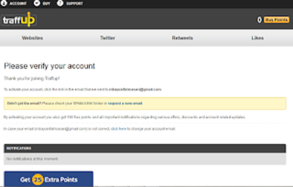
    3. On the page listed below, you will be asked to verify the account you just created. It should be noted that on this page you need to verify your account so that you can earn 100 points, by checking your email.
    On the page listed below, you will be asked to verify the account you just created. It should be noted that on this page you need to verify your account so that you can earn 100 points, by checking your email.

    screenshot
    4. The following is just an example, please use my email, it’s registered but in English, replace it with a language you can understand so it’s easy to read. You just need to click on translate message, in the image below I’m highlighting it. use purple squares.
    The following is just an example, please use my email, it's registered but in English, replace it with a language you can understand so it's easy to read. You just need to click on translate message, in the image below I'm highlighting it. use purple squares.

    screenshot


    Click the link in your email message, I have marked the red box in the image above.
    5. Finally, congratulations, and you managed to get 100 points, and you already have a traffic account.

  • How to Use Followlike.Net and Increase Site Traffic

    www.laborblog.my.id - Followlike is an SEO promotion tool that uses link building, SEO tools and social media to help you grow your business, while improving your Websites

    Screenshot
    Followlike – social exchange community. followlike is a free social exchange seo booster community. increase your social media, pagerank, alexa ranking, backlinks, bookmarks and seo keyword rankings today!
    What is Followlike?


    Followlike is an SEO promotion tool that uses link building, SEO tools and social media to help you grow your business, while improving your Websites, Social Networks, Videos & Music, Blogs, Backlinks & Bookmarks. You can promote anything you need as we connect you with our members looking for the same things. Improve search engine rankings and get free likes & free twitter followers from users who will genuinely interact with their web platforms.
    Social Media & Traffic Booster
    New website or old one? it does not matter. What does matter is traffic, backlinks, search engine ranking and social networking else customers dont know you exist. Followlike has many SEO tools that will help you improve search engine optimization and increase website traffic including backlinks and Unique Article Spinner. So improve your social media statistics today
    Likes, Shares & Bookmarking
    Why do you need more social networking? Social media now plays a huge part in your SEO. Increasing your subscribers, followers, fans, likes & shares on your social media sites is vital. What is seo? Major search engines use it to rank your websites popularity, so the more Social Exchanges you get the better you rank. This can be in the form of Likes or Social Bookmarks
    What can you Promote using Followlike?
    Your Website
    Promote your website across major platforms and explode your Traffic & Sales whilst improving its SEO
    Your Business
    Let the world know about your business and drive new Clients, Customers and Sales straight to you.
    Your Band, Tracks & Videos
    The world will know about your Band, Tracks or Videos by improving your exposure on major platforms.
    Your Social Networks
    Your Social Networks will greatly improve from followers, to likes and shares across leading social platforms.
    Why our System?… Followlike Social Exchange
    We are the most Advanced Social Promotion online. Never pay for fake followers, likes or traffic when you can get them from real people who want to be part of your Networks. Best of all its FREE
    More than 180,000 Members from over 200 countries
    All aspects of SEO and Social Promotion covered
    Fast and user friendly system
    Top support system.
    No. 1 tool for generating more traffic on your website & social accounts
    Quick registration and free points just for signing up
    Simply add your Link or Social Account. Offer a bid, then people will follow, like, view or share your content if they wish. Improving social media internet marketing, content marketing and seo daily.
    How to Register?


    1. Visit the site https://www.followlike.net
    2. Fill in the registration form according to the requested data
    3. Once registered, select the features you want to use. Important: 1 IP Address only for 1 account
    Good luck…[FollowLike.Net]